Menu
Close
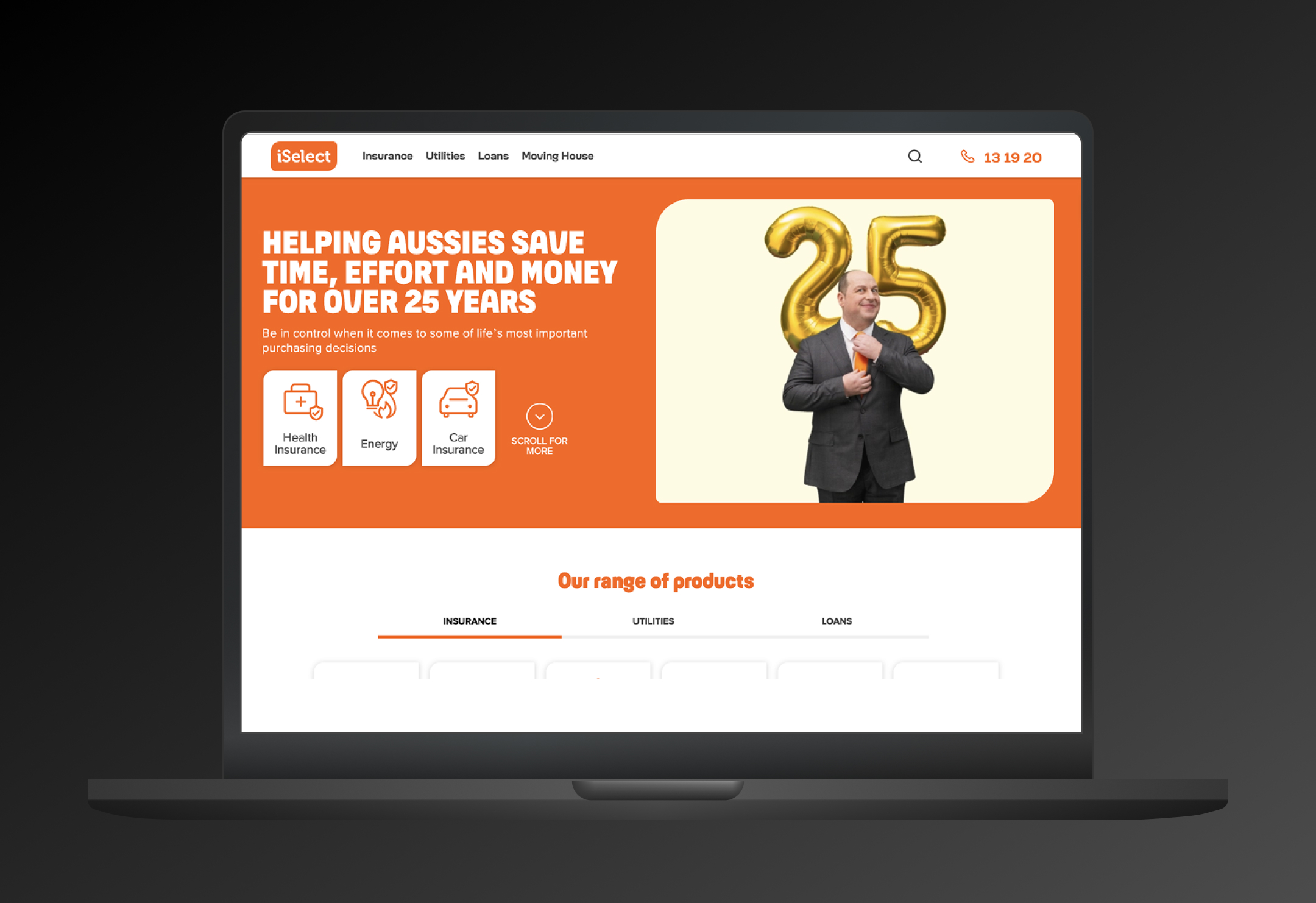
Company: iSelect - Australia's leading comparison platform
Project: Navigation architecture redesign to support multi-product expansion
Duration: 6 weeks
Role: UX Research & Design Lead
Team: UX Research, Product Design, Product Management
iSelect was expanding rapidly into new product verticals, but their existing navigation architecture couldn't scale.
The current structure risked overwhelming users with too many top-level options, potentially leading to:
Increased cognitive load
User frustration and confusion
Lost leads and conversions
Damage to brand equity
The Problem Statement
"How might we create a future-proof navigation architecture that can accommodate iSelect's expanding product portfolio while maintaining user clarity and reducing cognitive load?"
Key Constraints
Must support 18+ product verticals (current and planned)
Limited to 3-5 top-level navigation items
Must be SEO-friendly (changes are expensive and time-consuming)
Needed to work for 2-3 years without major restructuring
[ Fyi, the architecture is still working after 9 years ]
Why Customer-Led Design?
Rather than making assumptions about how products should be grouped, we decided to let customers define the information architecture.
This approach would:
-Provide competitive advantage through design-based differentiation
-Ensure navigation matches customer mental models
-Create a truly user-centered solution
Research Method: Card Sorting
We chose card sorting because it directly reveals how users naturally categorise information.
This method helps design information architecture by having participants organise topics into categories that make sense to them. How one person organises information is different from another person, so it's important to take a quantitiave scale to find a universal stucture most users agree with.
Study Design:Method: Open card sorting with labelling
Participants: 78 users
Cards: 18 product verticals (current and planned)
Task: Group related products and create category labels
Analysis: Similarity matrix and Participant-Centric Analysis (PCA)
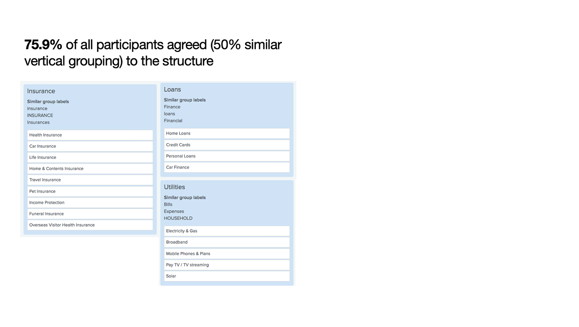
The Winning Structure 75.9% of participants agreed on a three-category navigation structure
Loans Insurance Utilities
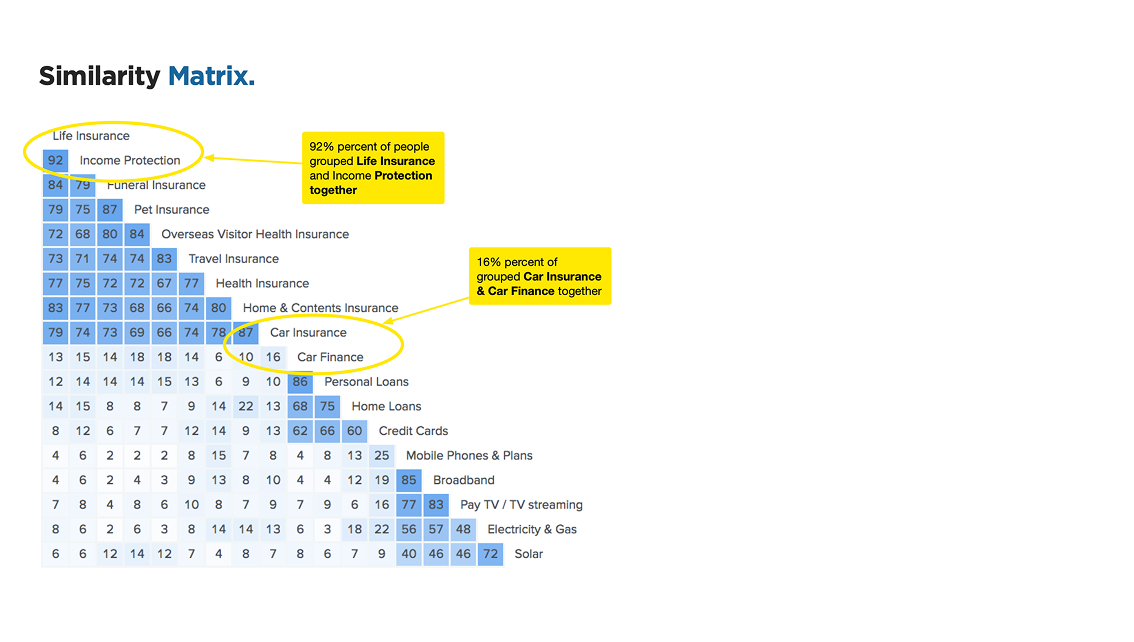
Critical Insights from Similarity Matrix
Strongest Association: 92% of participants grouped Life Insurance and Income Protection together - indicating these products are seen as closely related protection services.
Surprising Finding: Only 16% grouped Car Insurance and Car Finance together, despite both being car-related.
This suggests customers categorise by product type (insurance vs. financing) rather than by subject matter.
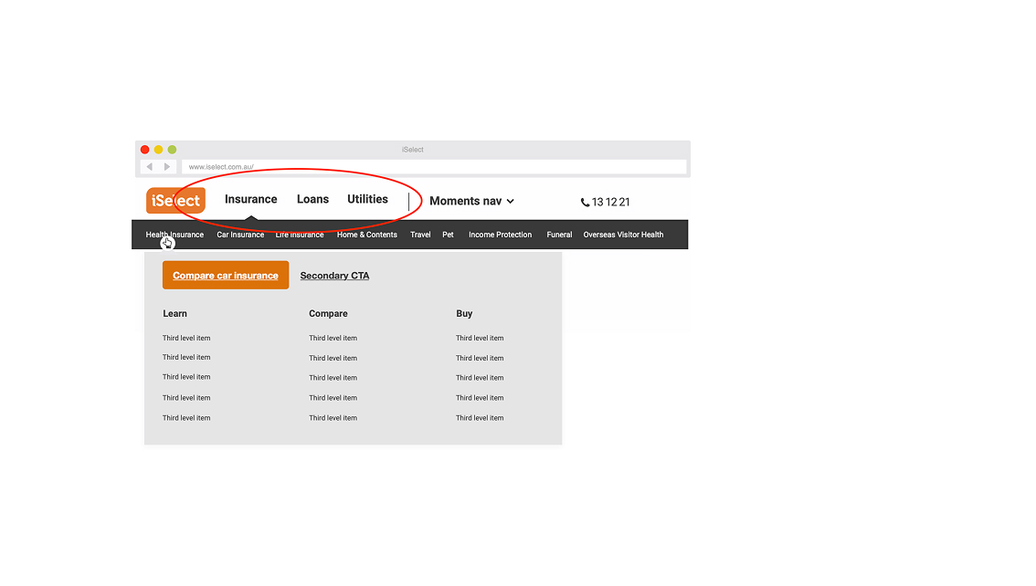
The New Navigation Architecture
Based on the research findings, we designed a clean three-tier navigation system:
Primary Navigation: Insurance | Loans | Utilities
Secondary Navigation: Product categories within each section
Tertiary Navigation: Learn | Compare | Buy journey steps
Key Design Decisions
Simplified Top-Level: Three clear categories reduce cognitive load while accommodating all products
Customer Language: Used terminology that emerged from participant labeling
Scalable Structure: New products can easily fit into existing categories
Journey-Focused: Secondary navigation supports the natural customer journey of learning, comparing, and purchasing
Conclusion
This customer-led research project successfully solved iSelect's navigation scalability challenge while providing a framework for future growth.
By prioritising user mental models over internal business logic, we created a navigation structure that serves both customer needs and business objectives.
The three-category structure (Insurance, Loans, Utilities) provides a clean, intuitive navigation experience that can accommodate iSelect's continued expansion while maintaining the cognitive simplicity that users need to successfully find and compare products.
Most importantly, this project demonstrates the power of user-centered design research in solving complex information architecture challenges.
This architecture is still working after 9 years +