
Menu
Close
iSelect, one of Australia's leading comparison websites, was facing a critical problem.
After years of expanding their product offerings across multiple verticals - from health insurance to broadband, car insurance to home loans - their mobile experience was failing users at crucial conversion points.
With the dramatic increase in mobile and tablet traffic, what had worked on desktop was creating frustration and abandonment on smaller screens.
The company needed a comprehensive analysis of their mobile user experience to identify exactly where users were getting stuck, frustrated, or simply giving up.
More importantly, they needed actionable solutions that their development team could implement to fix the most critical barriers to conversion.
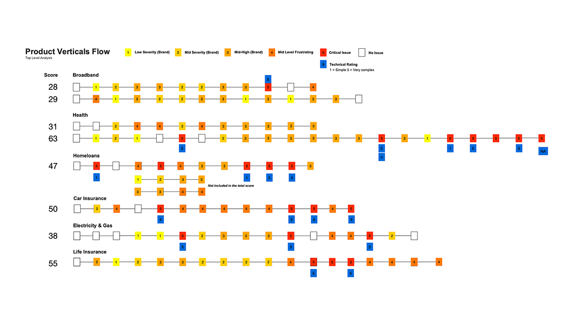
Systematic User Journey Analysis
The analysis revealed systematic usability problems that were creating significant barriers to conversion across all product areas.
The most severe issues weren't just inconveniences - they were complete showstoppers.
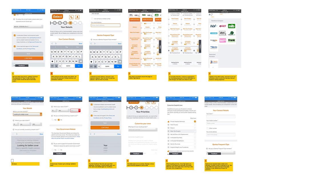
Critical Issue Pattern: Validation Failures
The most serious problem identified was a consistent validation failure pattern. When users clicked "Continue" and triggered a validation error, the browser window failed to auto-focus on the problematic field.
Users would wait 10+ seconds thinking the site wasn't working, completely unaware that a validation message had appeared above their screen view. This created a perception of technical failure rather than user error.
This single issue was likely causing massive abandonment rates, as users couldn't see what they needed to fix to proceed.
Several product verticals showed complete mobile interface failures:
Health Insurance: Users couldn't scroll or interact with comparison tables, with the interface completely locking up
Car Insurance: Registration input fields appeared broken with no clear indication of focus states
Life Insurance: Critical occupation selection fields were non-functional, preventing any user from completing the flow
For each identified issue, I provided specific, actionable solutions that balanced user experience improvements with technical implementation feasibility.
Immediate Fixes (Low Technical Complexity)
Validation Focus Management: Implement automatic browser focus on the first invalidated field after form submission, ensuring users can immediately see and fix problems.
Field State Clarity: Add clear "REQUIRED" and "OPTIONAL" labels to all form fields, eliminating guesswork and reducing validation errors.
Selection Guidance: Provide clear instructions for multi-choice scenarios (e.g., "Please choose 10 services required to start your cover" with dynamic updates as users make selections).
Medium-Term Improvements
Address Input Simplification: Replace complex multi-field address inputs with Google Location API integration, reducing friction and improving accuracy.
Mobile-Optimized Interfaces: Redesign comparison tables and complex selection interfaces specifically for mobile interaction patterns.Progress Indication: Implement clear progress indicators showing users how many steps remain in each flow.
Long-Term Strategic Changes
Mobile-First Redesign: Several product verticals required complete mobile interface rebuilds to address fundamental usability failures.
Responsive Navigation: Redesign navigation systems to provide consistent, persistent wayfinding across all screen sizes.
.jpg)
Navigation and Clarity Issues
Across all verticals, users faced consistent confusion about:
Whether form fields were required or optional
How many options they could select in multi-choice scenarios
What would happen when they clicked action buttons
How much longer the process would take
.jpg)
The analysis provided iSelect with a comprehensive roadmap for mobile experience improvements, prioritised by both user impact and technical feasibility.
By addressing the critical validation and focus management issues alone, the company could immediately reduce abandonment rates across all product verticals.
Scoring Results by Product
The systematic scoring revealed which products needed the most urgent attention:
Life Insurance: Highest severity score (55) due to critical functional failures
Car Insurance: High frustration score (50) from consistent validation issues
Health Insurance: Significant mobile interface problems requiring redesign
Broadband/Electricity & Gas: Lower severity scores but still important navigation improvements needed
Business Value
This analysis directly supported iSelect's mobile optimization strategy by:
Identifying revenue-blocking issues that were preventing conversions
Prioritising development resources toward the highest-impact fixes
Providing specific solutions rather than just problem identification
Creating a systematic approach for ongoing mobile experience monitoring
The comprehensive nature of this analysis - covering six product verticals with detailed user scenarios and technical implementation guidance - gave iSelect everything they needed to transform their mobile user experience from a conversion barrier into a competitive advantage.
Methodology Value
This case study demonstrates the power of systematic, scenario-based usability analysis.
Rather than surface-level observations, the deep user journey mapping with severity classification and technical complexity scoring provided actionable insights that development teams could immediately implement.
The approach of testing real user scenarios across multiple product areas revealed patterns and systemic issues that might have been missed in more limited analysis.
For organisations struggling with mobile conversion rates, this methodology provides a template for identifying not just what's broken, but exactly how to fix it in order of priority and impact.